- IT Services
- Data Visualization
We Translate Data into Actionable Intelligence
-
1. The Significance of Data Visualization at BIITSData visualization at BIITS is seen as an essential tool for simplifying, analyzing, and presenting data that can otherwise seem overwhelming. It enables clients to quickly grasp complex information and uncover hidden patterns, trends, and relationships within large datasets. Below are the core reasons why data visualization is pivotal to the company’s services: Key Benefits of Data Visualization:
- Improved Data Comprehension: Converts complex data into clear charts, graphs, and maps for easier understanding.
- Faster Decision-Making: Real-time visuals enable quick insights and immediate action.
- Insight & Trend Discovery: Helps identify hidden patterns, trends, and correlations in data.
- Enhanced Communication: Makes it easier to share insights across teams and stakeholders.
- Promotes Data-Driven Culture: Encourages decisions based on data, not guesswork.
-
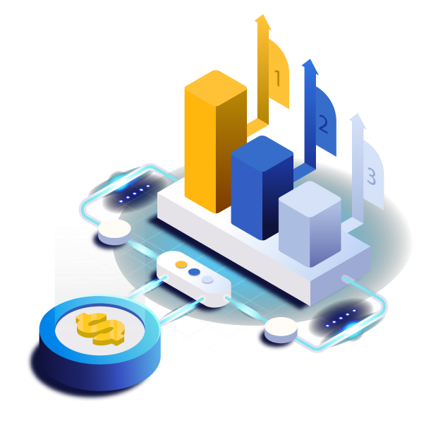
2. Core Services in Data Visualization at BIITS
BIITS provides a wide range of data visualization services designed to help businesses analyze data, make informed decisions, and promote growth. The core offerings include:- Interactive Dashboards:
- Real-Time Dashboards: Built using tools like Power BI, Tableau, and Qlik Sense to monitor KPIs and performance metrics in real time.
- Custom Dashboards: Tailored to specific business needs such as tracking sales, customer behaviour, or inventory.
- Custom Visual Solutions:
- Customized data visuals using Python (e.g., Plotly, Matplotlib) and R (e.g., ggplot2) to serve complex analytical needs across various industries.
- Geospatial Data Visualization:
- Tools like Leaflet.js and Google Maps API are used to visualize location-based data for tasks such as regional sales analysis and supply chain tracking.
- Business Intelligence Integration:
- Data from multiple sources (ERP, CRM, databases) is integrated into unified dashboards using BI platforms for real-time performance monitoring.
- Reporting and Analytics Automation:
- Automated, interactive reports on business performance metrics such as finance, operations, and customer insights are regularly generated.
3. Tools and Technologies Used for Data Visualization
BIITS uses a range of industry-leading data visualization tools and technologies to deliver solutions that are not only visually compelling but also rich in functionality.
Business Intelligence Tools:- Tableau: Builds interactive, shareable dashboards with advanced visual and data blending features.
- Power BI: Visualizes data from multiple sources; integrates well with Microsoft products.
- Qlik Sense: Offers customizable, interactive dashboards and associative data exploration.
Programming & Data Analysis Libraries:- Python
- Matplotlib: For basic static visualizations.
- Seaborn: For statistical charts like heatmaps and distribution plots.
- Plotly: For interactive, web-based visualizations.
- R:
- ggplot2: Creates layered, detailed visualizations.
- Plotly (R): Enables interactive, browser-based plots.
Geospatial Visualization Tools:- Leaflet.js: Used to build interactive maps for location-based data.
- Google Maps API: Integrates custom maps into applications for geospatial analytics.
Web & Cloud-Based Tools:- Google Data Studio: Cloud-based tool for creating and sharing interactive dashboards.
- D3.js: JavaScript library for custom, interactive web visualizations.
4. Key Business Applications of Data Visualization
BIITS helps businesses in various sectors leverage data visualization to drive performance, efficiency, and growth. Below are the key business applications where data visualization plays an essential role:- Sales & Marketing Analytics: Tracks sales, customer behavior, and campaign performance; visualizes segmentation and trends to refine marketing strategies.
- Financial & Accounting Analytics: Displays financial KPIs (e.g., revenue, expenses, profit margins) to aid budgeting and strategic financial planning.
- Supply Chain & Logistics: Visualizes inventory, orders, and delivery metrics to optimize operations and resolve logistics bottlenecks.
- HR Analytics: Analyzes employee performance, retention, and recruitment through dashboards to support HR decisions. Customer Analytics: Examines customer feedback, loyalty, and buying behavior to improve product offerings and retention strategies.
- Healthcare Analytics: Tracks patient outcomes and hospital metrics; visualizes trends like disease spread and resource usage for better care management.
5. Benefits of Data Visualization for Clients
Data visualization offers several key advantages to BIITS's clients:- Clarity and Insight:Complex data is distilled into simple, visually appealing formats, enabling businesses to uncover insights they may have missed in raw data.
- Real-Time Decision Making: With interactive dashboards and live data integration, businesses can make decisions on the fly, responding immediately to changes in market conditions or operations.
- Enhanced Communication: Visual reports and dashboards make it easier to communicate data findings across teams, departments, and stakeholders, ensuring everyone is aligned with key business objectives.
- Increased Operational Efficiency: Automated reporting and real-time visualization reduce the time spent on data analysis, freeing up resources for more strategic tasks.
6. Future Directions for Data Visualization at BIITS
Looking to the future, BIITS is exploring the integration of emerging technologies to enhance their data visualization capabilities further:- Artificial Intelligence and Machine Learning Integration:Leveraging AI/ML to generate predictive insights and integrate them into visualizations, helping clients forecast trends and make proactive decisions.
- Augmented Reality (AR) :Using AR for visualizing 3D data models, ideal for industries such as real estate, manufacturing, and logistics.
- Advanced Analytics and Predictive Dashboards : Building dashboards that integrate both historical and predictive analytics, providing clients with a future outlook based on current trends.
Visualization Structure at B Informative IT Services Pvt Ltd (BIITS)
At BIITS, the visualization structure is designed to ensure that businesses can quickly transform raw data into meaningful insights through visually appealing and easily interpretable graphics. This structure encompasses the various stages of data visualization, the tools used, and the methodologies followed to create effective and efficient visualizations that align with clients' business needs.
Here’s a breakdown of the Visualization Structure at BIITS:
1. Data Collection & Integration:- Gathers data from internal systems, cloud platforms, APIs, and IoT devices.
- Uses ETL tools, data warehouses, and data lakes for clean and unified datasets.
- Cleans, normalizes, and aggregates data.
- Applies data modeling, filtering, and statistical calculations for analysis.
- Follows user-centric, clear, and consistent design principles.
- Uses various chart types (bar, pie, heatmap, Gantt, geospatial, etc.).
- Develops real-time and customizable interactive dashboards.
- BI Tools: Tableau, Power BI, Qlik Sense.
- Python Libraries: Matplotlib, Seaborn, Plotly.
- Geospatial Tools: Leaflet.js, Google Maps API.
- Integrates dashboards with CRM/ERP systems and cloud platforms.
- Automates report scheduling for regular insights.
- Ensures fast data refresh and dashboard performance.
- Adapts visualizations using user feedback, A/B testing, and scaling strategies.
- Enforces role-based access (RBAC) and data encryption.
- Ensures compliance with data privacy laws like GDPR and CCPA.
Benefits of choosing BIITS for your Data Visualization services
Clarity and Insight: Complex data is distilled into simple, visually appealing formats, enabling businesses to uncover insights they may have missed in raw data.
Real-Time Decision Making: With interactive dashboards and live data integration, businesses can make decisions on the fly, responding immediately to changes in market conditions or operations.
Enhanced Communication: Visual reports and dashboards make it easier to communicate data findings across teams, departments, and stakeholders, ensuring everyone is aligned with key business objectives.
Increased Operational Efficiency: Automated reporting and real-time visualization reduce the time spent on data analysis, freeing up resources for more strategic tasks.
Frequently Asked Questions
What is Data Visualization?Data Visualization is the process of transforming raw data into graphical or visual representations, such as charts, graphs, maps, or dashboards. This allows businesses to easily interpret complex data, identify trends, and make informed decisions quickly.
Why is Data Visualization Important for Businesses?Data visualization enables businesses to:
- Make faster decisions by understanding insights at a glance.
- Identify trends and patterns within large datasets that are difficult to detect manually.
- Improve communication by making data more understandable to different stakeholders.
- Enhance data-driven decision-making, reducing reliance on intuition or guesswork.
What Tools and Technologies Does BIITS Use for Data Visualization?BIITS uses a range of leading tools and technologies to create powerful data visualizations:
- Business Intelligence (BI) Tools: Tableau, Power BI, Qlik Sense.
- Programming Libraries: Matplotlib, Seaborn, Plotly (Python); ggplot2, plotly (R) (R).
- Geospatial Visualization: Leaflet.js, Google Maps API.
- Cloud & Web Solutions: Google Data Studio, D3.js.
How Does BIITS Ensure Data Quality for Visualization?BIITS follows a meticulous ETL (Extract, Transform, Load) process to ensure that the data used in visualizations is clean, consistent, and accurate. This includes:
- Data cleaning to remove inaccuracies or incomplete data.
- Normalization to ensure data consistency across various sources.
- Data aggregation and statistical calculations to ensure meaningful and actionable insights.
Can BIITS Create Custom Dashboards for My Business?Yes, BIITS specializes in creating custom dashboards tailored to the specific needs of your business. Whether you need to track sales, customer behavior, financial performance, or any other metrics, BIITS can design interactive dashboards that provide real-time data and insights suited to your organization’s goals.
What Types of Visualizations Can BIITS Create?BIITS can create a variety of visualizations, including:
- Bar charts, line charts, pie charts, and scatter plots.
- Heatmaps for visualizing correlations or intensity.
- Geospatial maps for location-based data visualization.
- Tree maps, Gantt charts, and bullet charts for more complex or hierarchical data.
- Interactive dashboards with drill-down capabilities for deeper analysis.
How Do Interactive Dashboards Work?Interactive dashboards allow users to explore and manipulate data in real time. Users can filter, sort, and drill down into specific data points to uncover insights tailored to their needs. This provides flexibility and allows stakeholders to get answers to specific questions instantly.
How Does BIITS Handle Real-Time Data Visualization?BIITS uses real-time data integration to ensure that dashboards and reports reflect the most current information. By connecting directly to live data sources (e.g., databases, CRM systems), visualizations are automatically updated, providing users with up-to-date insights at all times.
What Industries Can Benefit from BIITS' Data Visualization Services?BIITS’ data visualization services cater to a wide range of industries, including:
- Finance: Financial reporting, risk analysis, and budget tracking.
- Healthcare: Patient data analytics, hospital performance, and resource management.
- Retail: Sales analytics, inventory management, and customer behavior analysis.
- Manufacturing: Supply chain optimization, production monitoring, and equipment performance.
- Marketing: Campaign performance, customer segmentation, and social media analytics.
Is Data Visualization Secure?Yes, BIITS takes security seriously. All visualizations and dashboards are protected by robust role-based access control (RBAC) and data encryption. Clients have the ability to set user permissions to ensure that sensitive data is only accessible to authorized individuals. BIITS also complies with data protection regulations like GDPR and CCPA to ensure data privacy.
How Can Data Visualization Improve My Decision-Making?Data visualization helps you:
- Quickly spot trends in sales, customer behavior, and market conditions.
- Visualize business performance metrics (e.g., revenue, profits, KPIs) to make informed strategic decisions.
- Communicate data insights effectively across teams or stakeholders.
- Monitor performance in real-time, allowing you to react swiftly to changes in business conditions.
Can BIITS Integrate Data Visualizations with Existing Systems?Yes, BIITS specializes in creating custom dashboards tailored to the specific needs of your business. Whether you need to track sales, customer behavior, financial performance, or any other metrics, BIITS can design interactive dashboards that provide real-time data and insights suited to your organization’s goals.
What Makes BIITS' Data Visualization Services Unique?BIITS distinguishes itself through:
- Custom Solutions: Tailored visualizations based on specific business requirements.
- Cutting-Edge Tools: Use of the latest tools and technologies like Power BI, Tableau, and Python/R libraries.
- Expertise: A team of experienced professionals who understand both data analytics and business strategy.
- Client-Centric Approach: Focused on delivering solutions that align with the client’s objectives, goals, and industry requirements.
How Do I Get Started with Data Visualization at BIITS?To get started, simply contact BIITS for a consultation. During the initial discussion, the team will understand your specific data challenges, business objectives, and goals. From there, BIITS will create a customized plan to implement data visualization solutions that meet your needs.
Can BIITS Provide Ongoing Support for Data Visualizations?Yes, BIITS offers ongoing support for maintaining and optimizing your data visualizations. This includes updating visualizations as new data becomes available, improving dashboard performance, and adding new features as your business needs evolve.
Not sure how to use your company's data to your advantage?
Let us help you make the most of your data. Contact us today.
- Interactive Dashboards: